Enterprise UX and UI
Wireframe to Final Interface | Tech & Telecom
OVERVIEW
Enterprise software demands more than aesthetics. These projects required end-to-end UX thinking: discovery, architecture, wireframing, and high-fidelity UI execution for clients in telecom and logistics. I led both from brief to final interface, working directly with product and engineering teams to ship design that functioned at scale.
Selected enterprise UX work from 13+ years of digital product experience.
MY ROLE
UX STRATEGY & ARCHITECTURE
WIREFRAMING & PROTOTYPING
UI DESIGN & EXECUTION
DIGITAL DESIGN
PRODUCT COLLABORATION
UI execution
Creative direction is strategy. UI design is where that strategy meets the pixel. These projects show both modes, from first wireframe to final shipped interface, done over a decade ago when UX was still being defined as a discipline.
Rogers Connection Manager

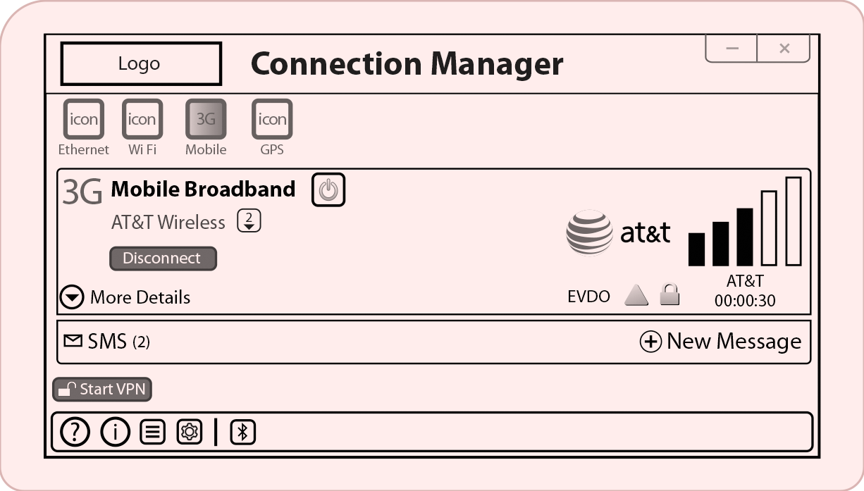
UX Blueprint:
Structural Wireframe
Low-fidelity validation of the primary connection status hierarchy.
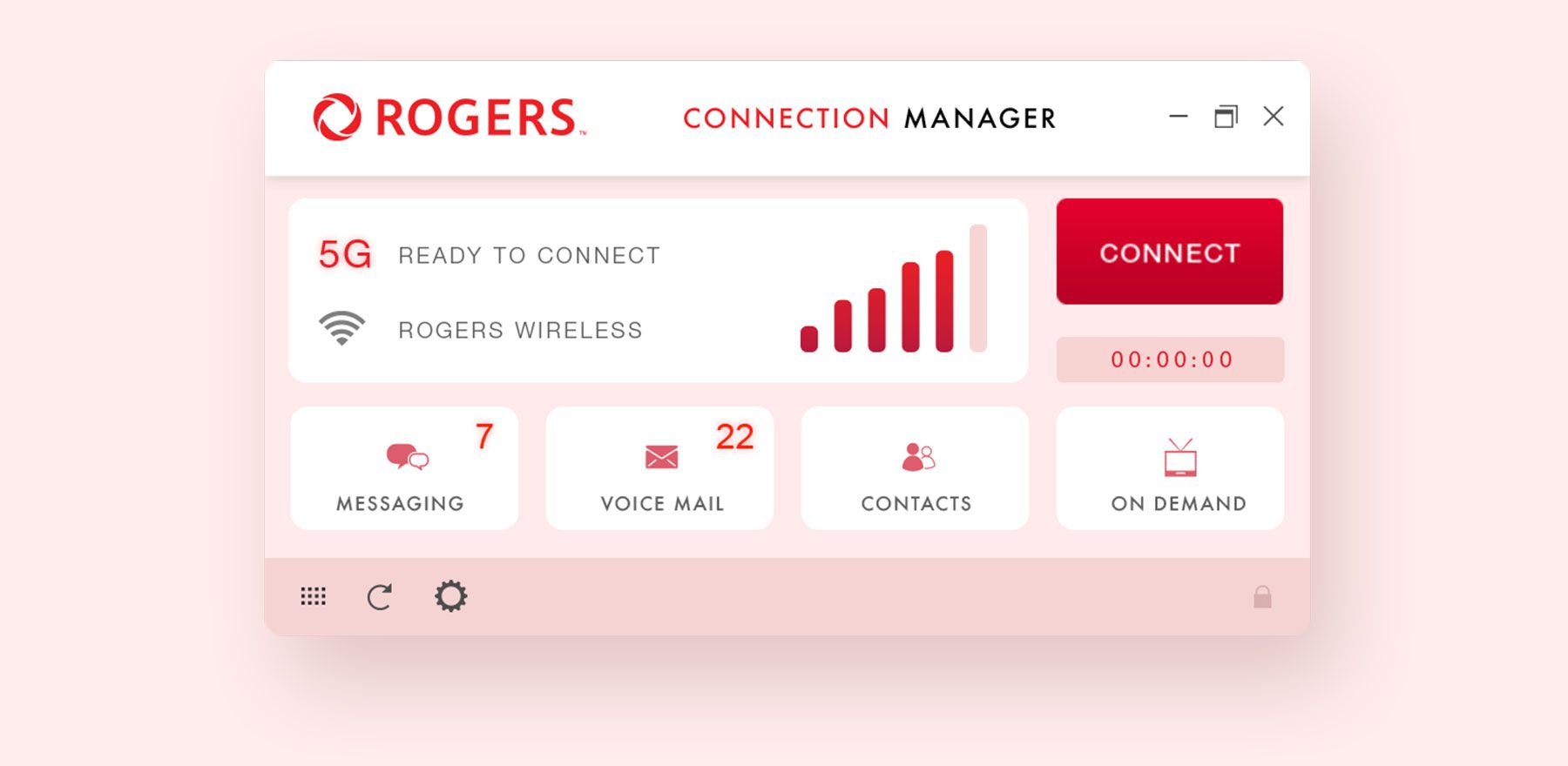
UI Execution:
Final Interface
High-fidelity design system applying brand guidelines to the approved structure.
The Challenge
Rogers needed to simplify a legacy connection management system that had grown too complex for everyday users.
The interface carried years of feature additions with no unified UX logic, creating friction at every step of the user journey.
The ProcesS
I started with low-fidelity wireframes to validate the core navigation hierarchy before any visual design began.
Each screen was tested against the primary user task: managing connections quickly, with no room for confusion.
THE RESULT
A streamlined dashboard that reduced interface complexity and gave users direct access to the actions they needed most.
The final UI was approved by Rogers engineering and product teams and shipped without redesign requests.
ENTERPRISE PRODUCT UI
Built to compete.
SendStuffNow was designed to go head to head with Dropbox in the early cloud file-sharing market. The product required an interface that could match the simplicity of a category leader while handling the operational complexity that enterprise logistics teams actually needed. This is the UI that made that possible.

Enterprise File Sharing Platform

UI EXECUTION
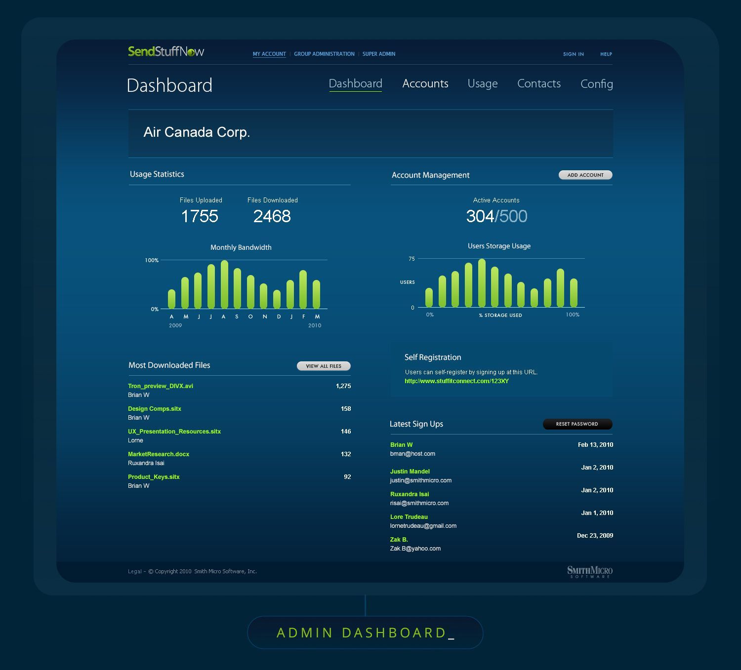
Operational Command Center
High-level overview of all active file transfers and storage quotas for enterprise tenants, designed for real-time operational visibility at a glance.
UI EXECUTION
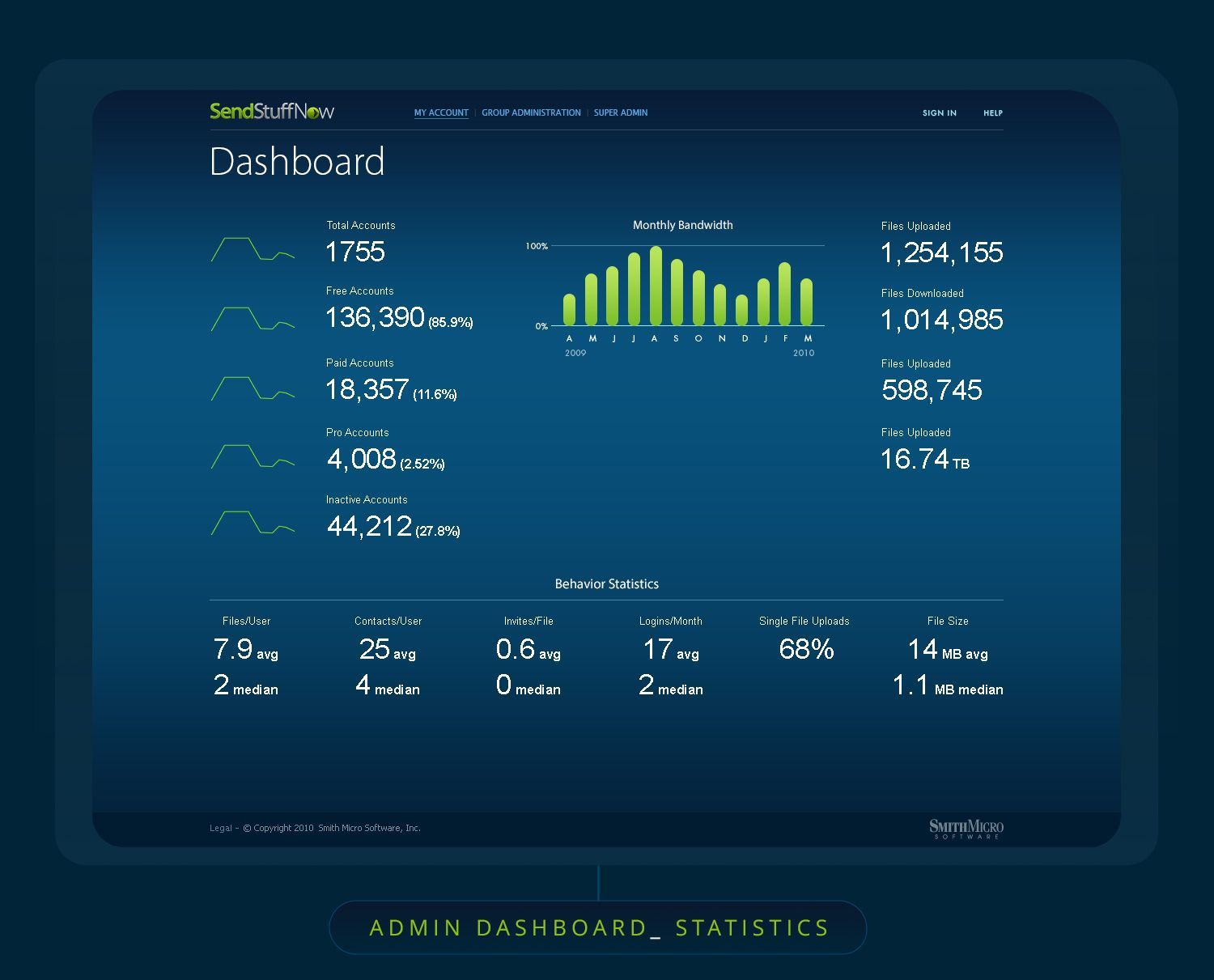
Statistical Analysis View
Granular traffic monitoring and user activity metrics designed for IT lead forecasting and capacity planning.
The Challenge
SendStuffNow was built to compete directly with Dropbox in the early cloud file-sharing market.
The product needed a UI that matched the simplicity of a category leader while serving the more complex operational and analytics needs of enterprise logistics teams.
The ProcesS
I designed a modular UI system built around two core user needs: operational management and data visibility.
Each component was designed to reduce cognitive load while surfacing the right information at the right moment, without requiring training to navigate.
THE RESULT
A scalable enterprise dashboard that gave logistics teams real-time clarity across all operations.
The command center and analytics views eliminated the need for separate reporting tools, consolidating insight by 40%.