Toyota
Interactive Experience Design | Automotive & Events
OVERVIEW
As Art Director at Studio PMG, I led the full creative and production team behind Toyota's large-format interactive booth experience. I directed 3D animators, UI designers, programmers, illustrators, and photographers to deliver two complete systems: a panoramic attract loop and a multitouch interactive wall. The experience ran at a national automotive show and was built around a real 100,000-mile Toyota Camry independently tested by AMCI. Work completed 14+ years ago at Studio PMG.
MY ROLE
ART DIRECTION
INTERACTIVE EXPERIENCE DESIGN
UI GRAPHIC DESIGN
TEAM DIRECTION
PHOTOGRAPHER DIRECTION
THE EXPERIENCE
Built around proof.
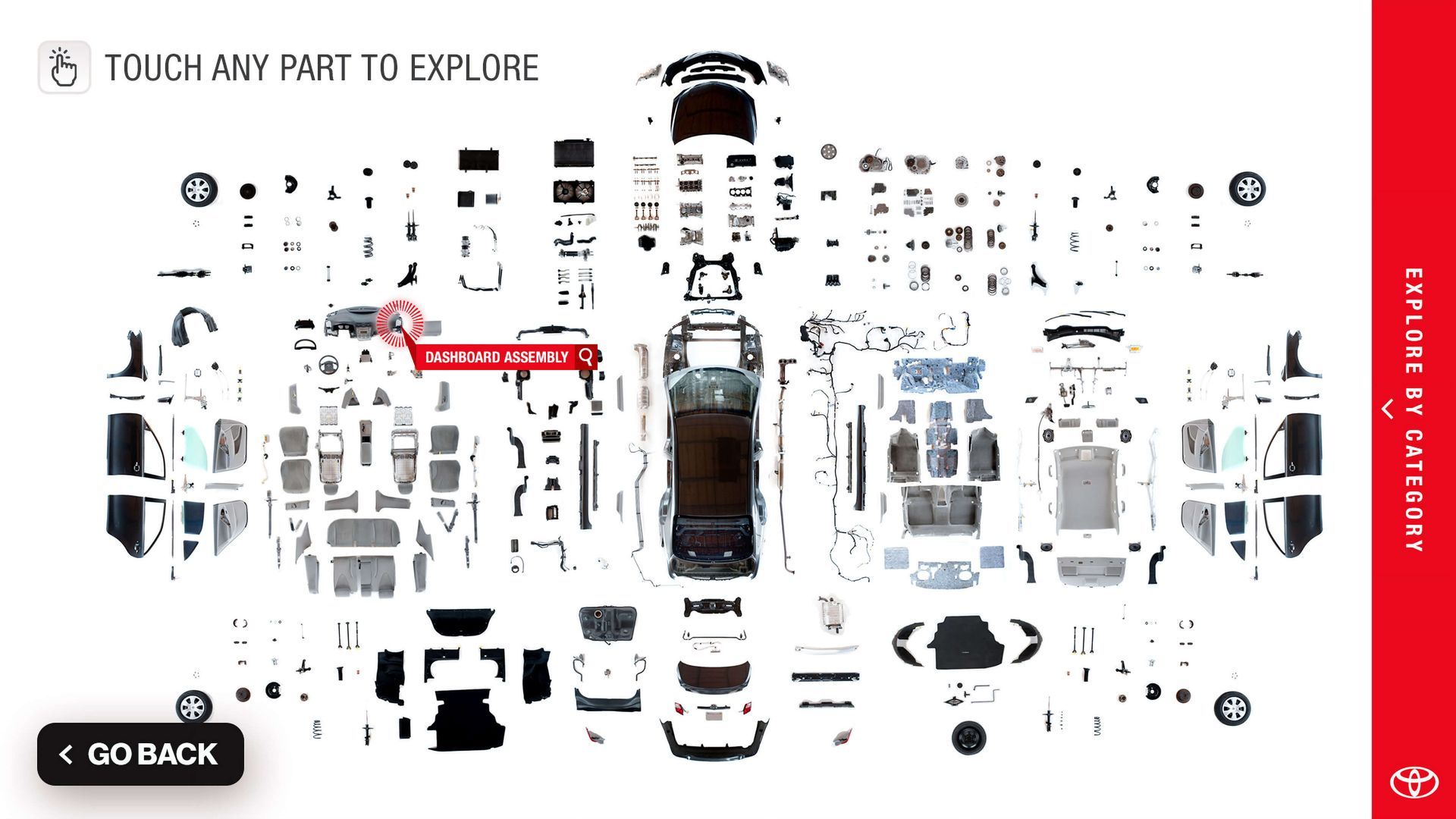
The installation centered on a real Toyota Camry that had been fully disassembled after 100,000 miles of independent testing by AMCI.
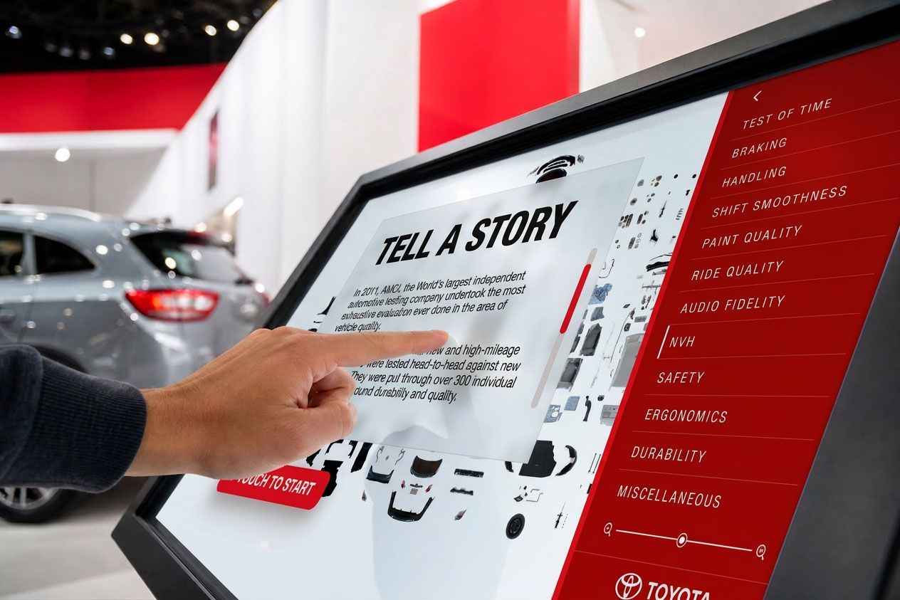
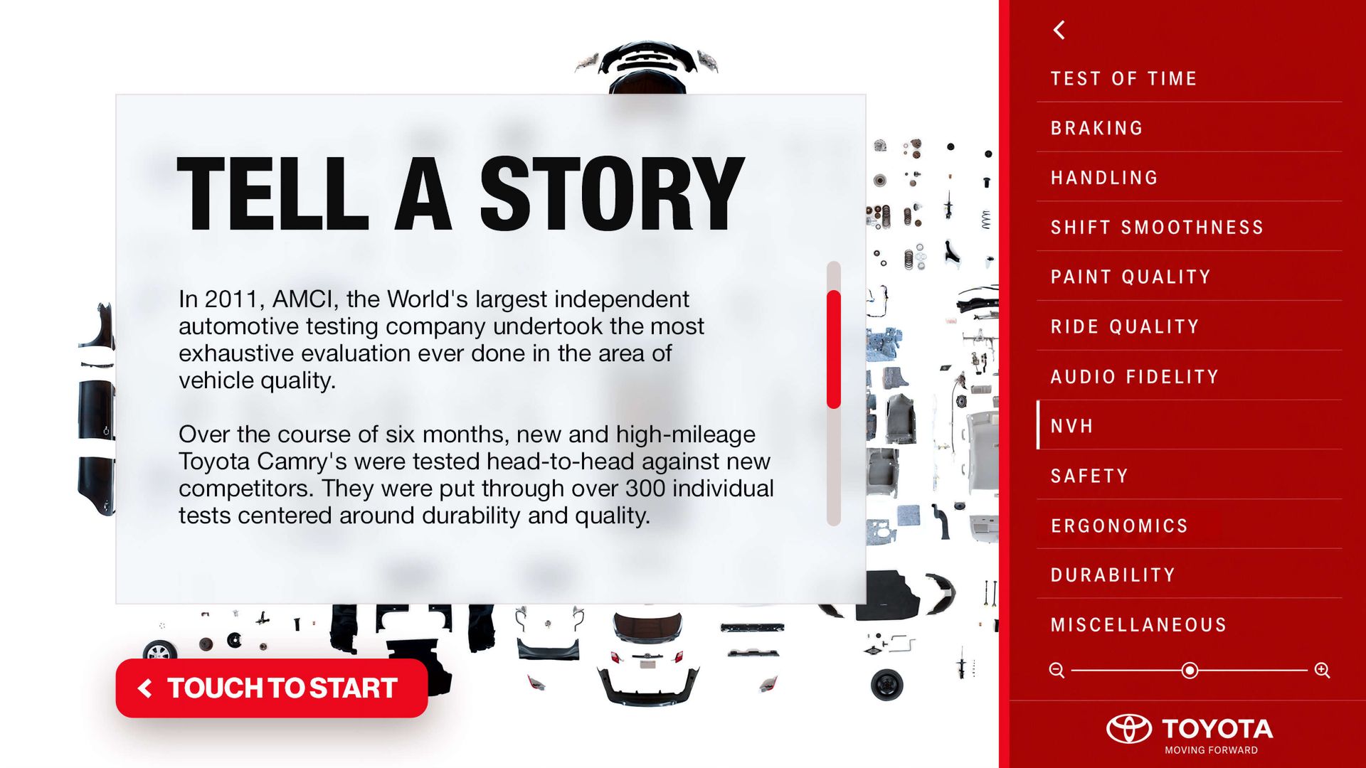
Every part was catalogued and made explorable through a large multitouch interface covering eleven quality categories from braking and handling to audio fidelity and durability.


ART DIRECTION
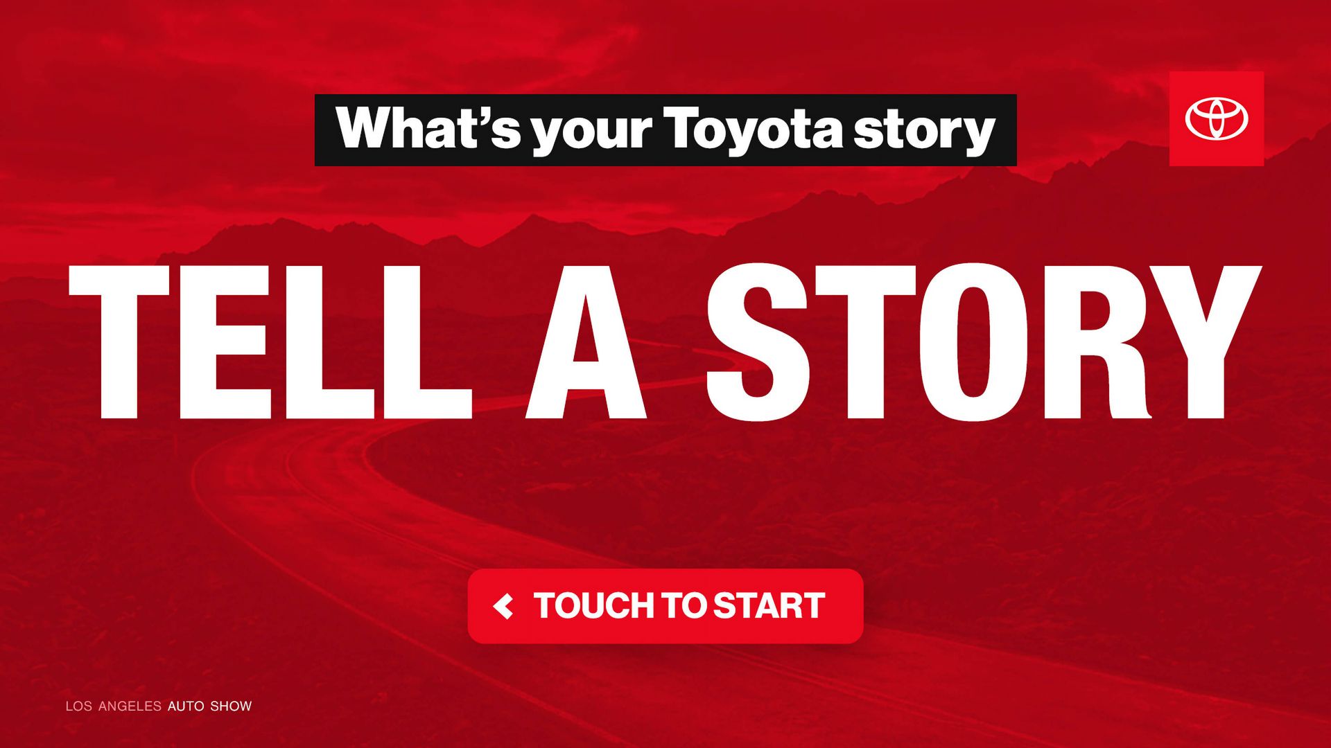
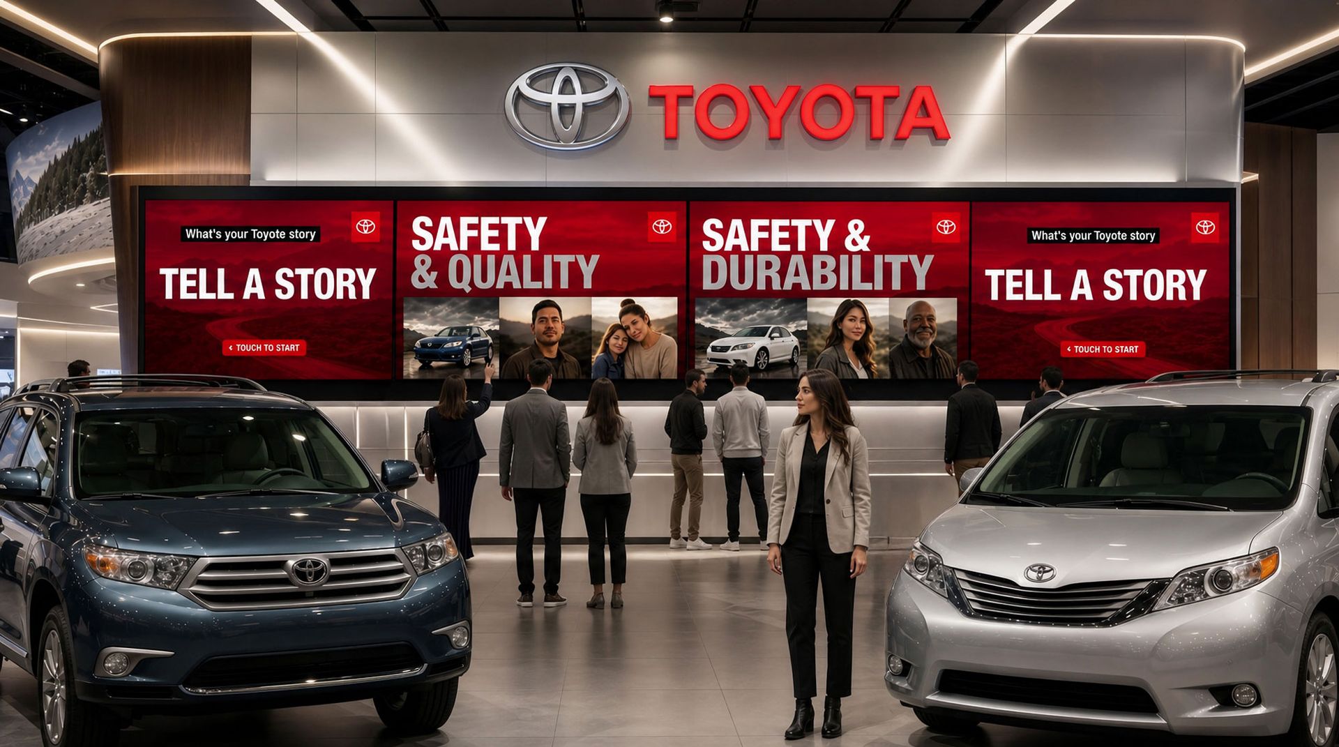
I directed the visual design of three rotating attract loop screens displayed on a panoramic wall to draw visitors into the booth. Each screen built the brand narrative around Toyota's core pillars using bold typography, cinematic photography, and real owner stories.

Every part. Every detail.
INTERACTIVE EXPERIENCE
Visitors could touch any component of the fully disassembled Camry on a large multitouch wall and access quality data, AMCI test results, and engineering insights for each part. I art directed the full UI system and worked directly with the development team to ensure every interaction felt precise and purposeful.
the results
DIRECTION
Led a multidisciplinary team of 3D animators, UI designers, programmers, illustrators, and photographers to deliver two complete interactive systems on a fixed event timeline.
SCALE
Every graphic and interaction designed for large-format display, from a panoramic broadcast wall to a close-up multitouch diagram, without losing visual precision at any scale.
IMPACT
A quality-focused interactive experience that gave Toyota's show floor visitors a reason to stop, engage, and walk away with a measurable understanding of what makes a Toyota last.