Finfare

Brand Strategy & identity | Fintech
OVERVIEW

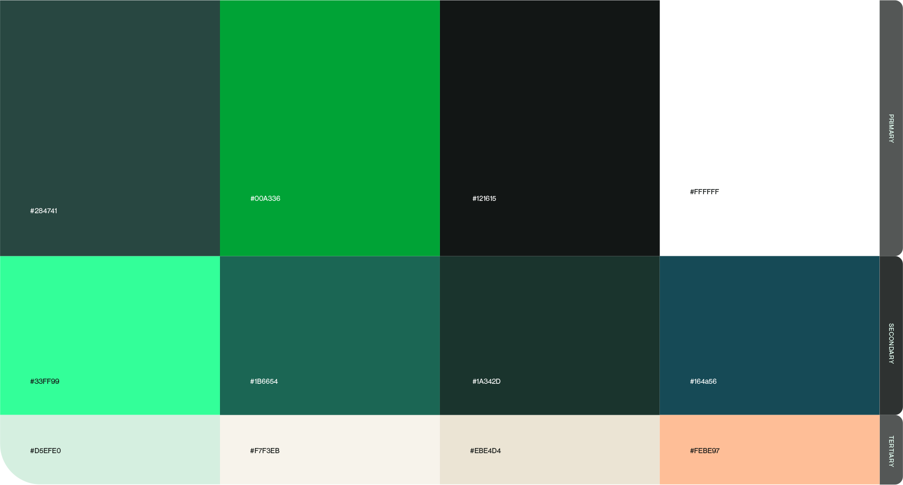
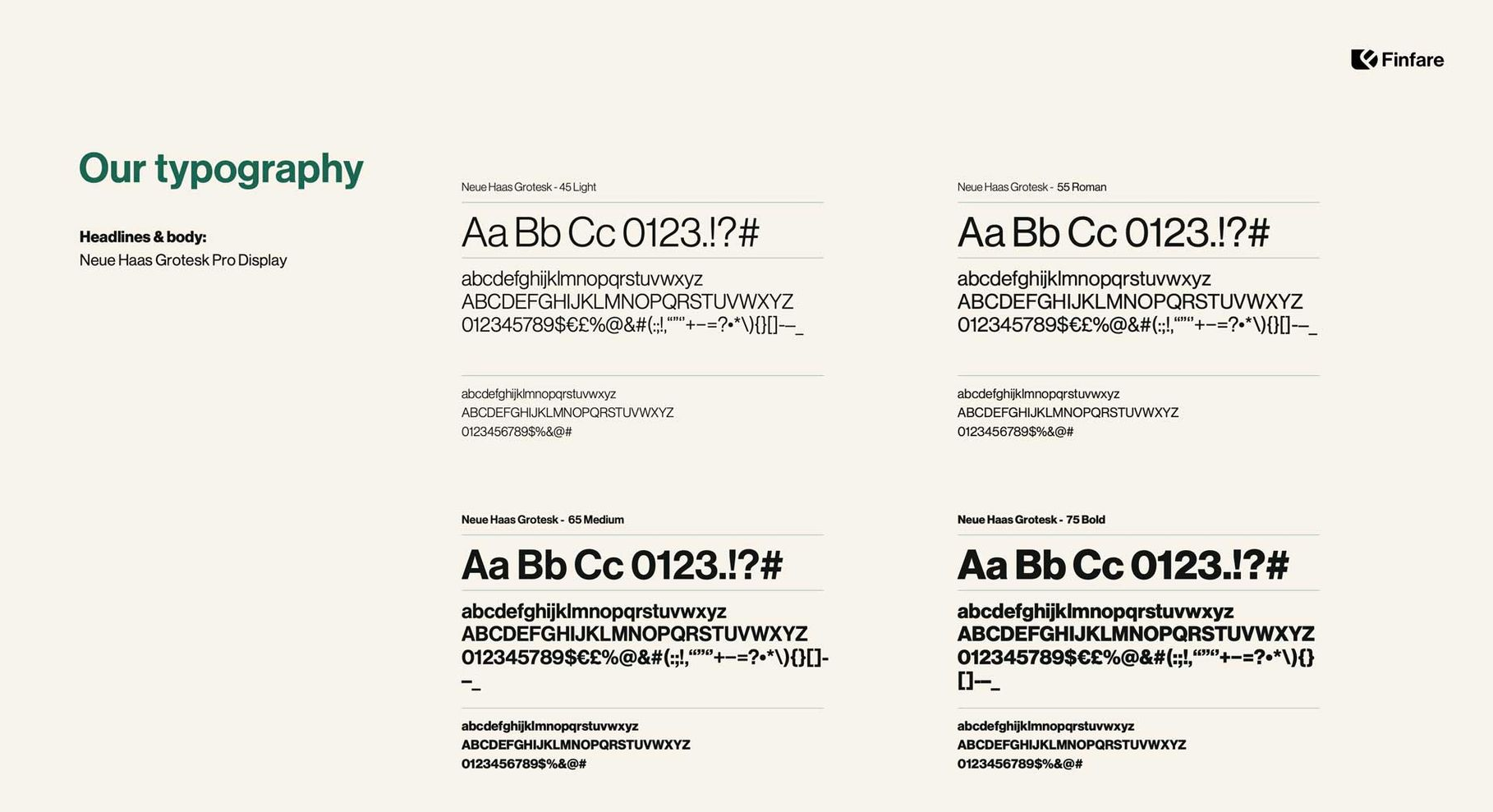
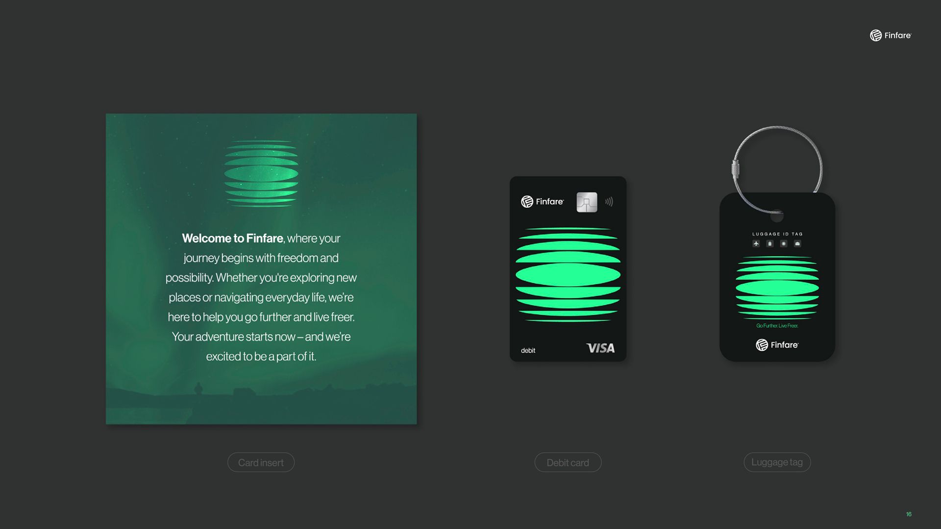
As Creative Director at Finfare, I led a full brand transformation covering both strategy and identity: purpose, tone of voice, messaging architecture, visual system, and scalable assets.

I built the creative function from zero, hiring designers, illustrators, and copywriters while managing agency partnerships. Working directly with the CMO and CEO, I delivered a complete brand ecosystem ready to scale.

MY ROLE

Brand strategy
Creative direction
BRAND IDENTITY DESIGN
Design System
TEAM BUILDING & OPERATIONS

Brand strategy

Fintare logo, compass icon, mission statement, and a girl looking up at a forest.
BRAND FOUNDATION

The foundation work included vision, mission, values, and positioning—all reframed to reflect Finfare’s ambition to transform the financial experience and serve both consumers and enterprise clients.

Vision statement graphic: Girl looking up;
Slide titled
Slide with
Mission statement on a brown, textured background. Text: simplify financial experiences for small businesses.
VERBAL IDENTITY
Text:
Slide titled

Brand identity

Logo system

The Finfare logo was designed to feel strong, adaptable, and trustworthy.  A modular approach allows the brandmark to be used independently or locked with type, making it flexible across web, product, and marketing.

Finfare logo with blue water background and variations on black and white backgrounds.
COLORS
Color palette featuring shades of green, black, white, and beige.

TYPOGRAPHY

SHAPES & IMAGES

Shapes


The shape system gives Finfare its own visual grammar—allowing the brand to create memorable moments and meaningful visual rhythm across channels.

Collection of dark green icons against a cream background; various abstract shapes.

Shapes

with masked images


These masked shapes incorporate natural textures to express Finfare’s human-centered benefits and product features. They serve as brand carriers across campaigns, packaging, and product visuals.

Collection of dark green icons against a cream background; various abstract shapes.
Scalable asset usage

A wide set of branded mockups shows how the identity adapts to digital, print, and wearable touchpoints—ensuring a cohesive visual experience, whether in pixels or real-world applications.

Black credit card with green design, displayed on a dark surface and against a dark background.
MERCHANDISING
Black zip-up hoodie and white t-shirt on a green background.
Two dark green bomber jackets with white and green logos displayed on a green background.
the results

A unified brand strategy and cohesive visual system gave every team, partner, and agency a shared language to communicate with confidence and purpose.


The rebrand elevated Finfare's credibility with investors, enterprise clients, and internal stakeholders — turning a utility tool into a trusted financial brand.


A scalable design toolkit and clear strategic framework reduced creative bottlenecks, accelerated production, and enabled faster content creation across departments. AI-assisted workflows were integrated throughout.