Brand Identity Design Creative Direction Design System
OVERVIEW
As lead creative director, I reimagined Finfare’s brand identity to match its ambition as a modern fintech innovator. From logo design to branded assets and scalable systems, I delivered a complete identity ecosystem that empowers consistency across platforms, teams, and touchpoints.
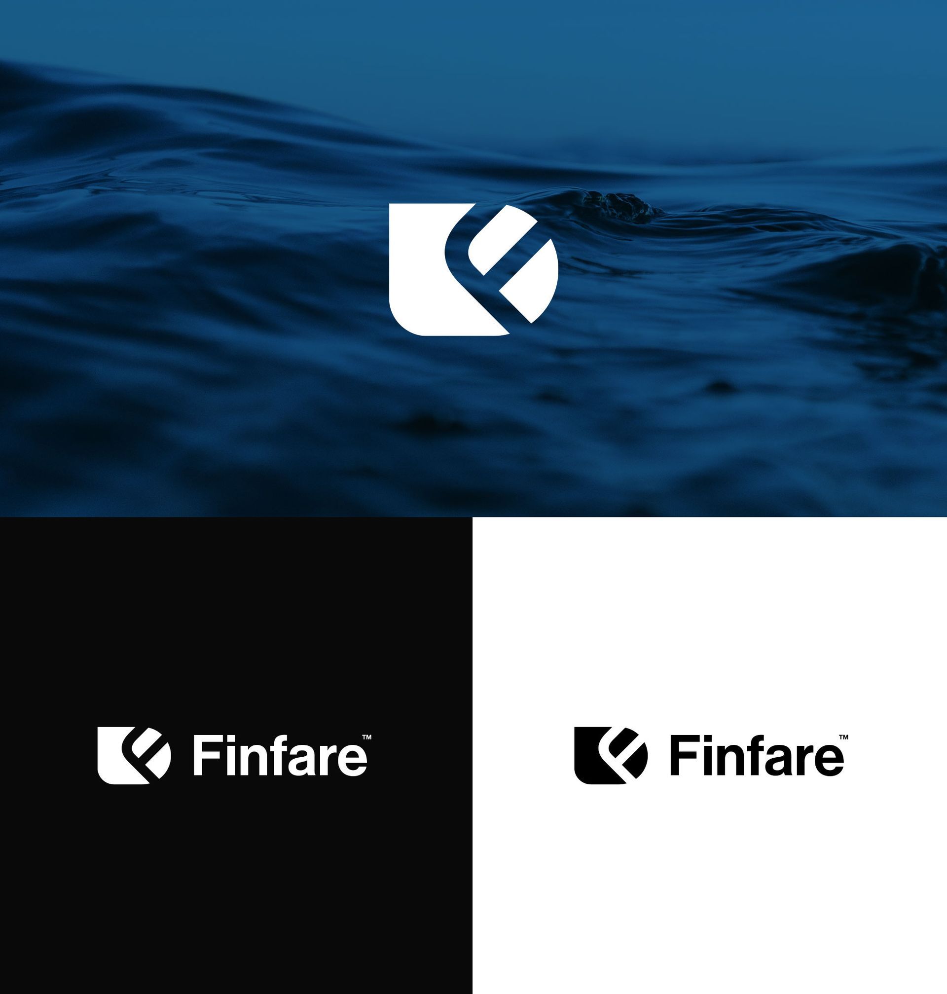
Logo system
The Finfare logo was designed to feel strong, adaptable, and trustworthy. A modular approach allows the brandmark to be used independently or locked with type, making it flexible across web, product, and marketing.
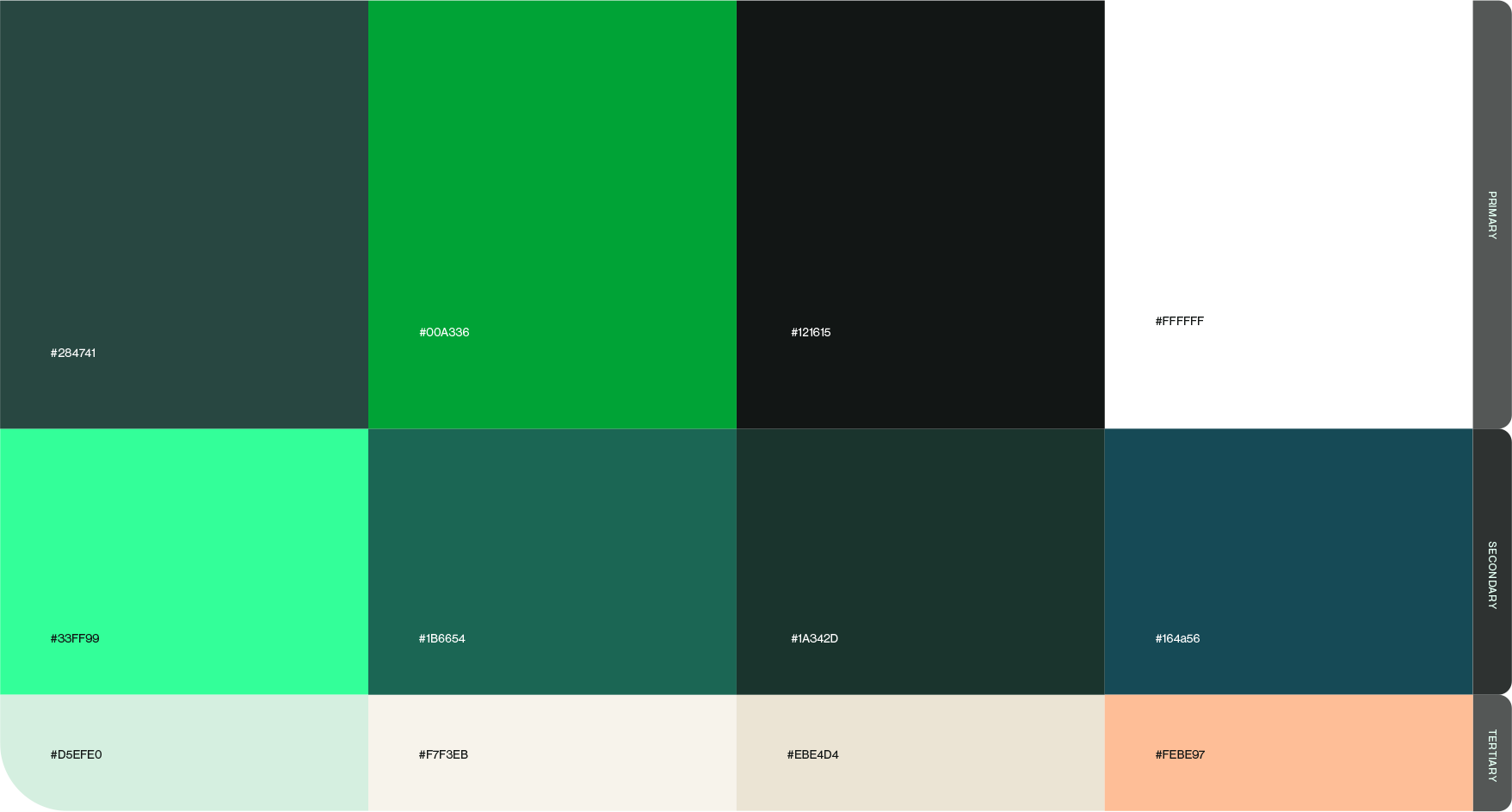
COLORS
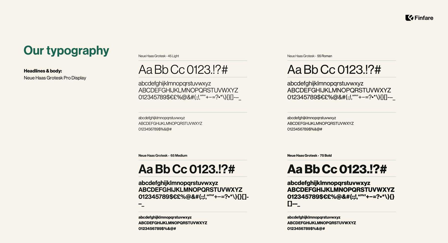
TYPOGRAPHY
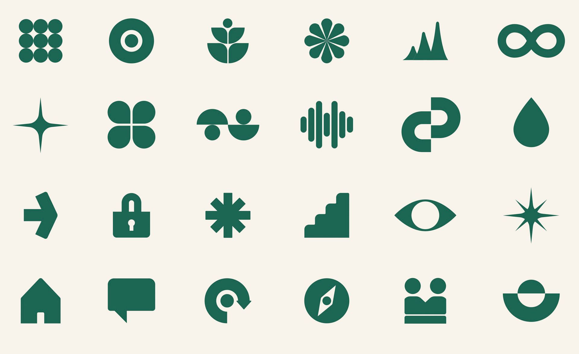
SHAPES & IMAGES
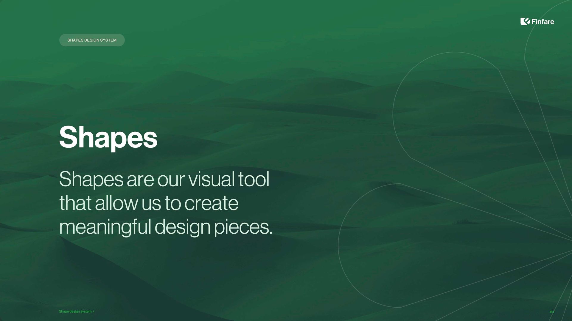
Shapes
The shape system gives Finfare its own visual grammar—allowing the brand to create memorable moments and meaningful visual rhythm across channels.
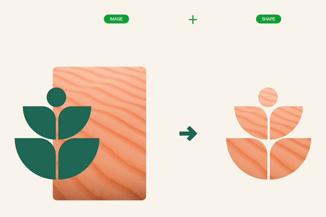
Shapes
with masked images
These masked shapes incorporate natural textures to express Finfare’s human-centered benefits and product features. They serve as brand carriers across campaigns, packaging, and product visuals.
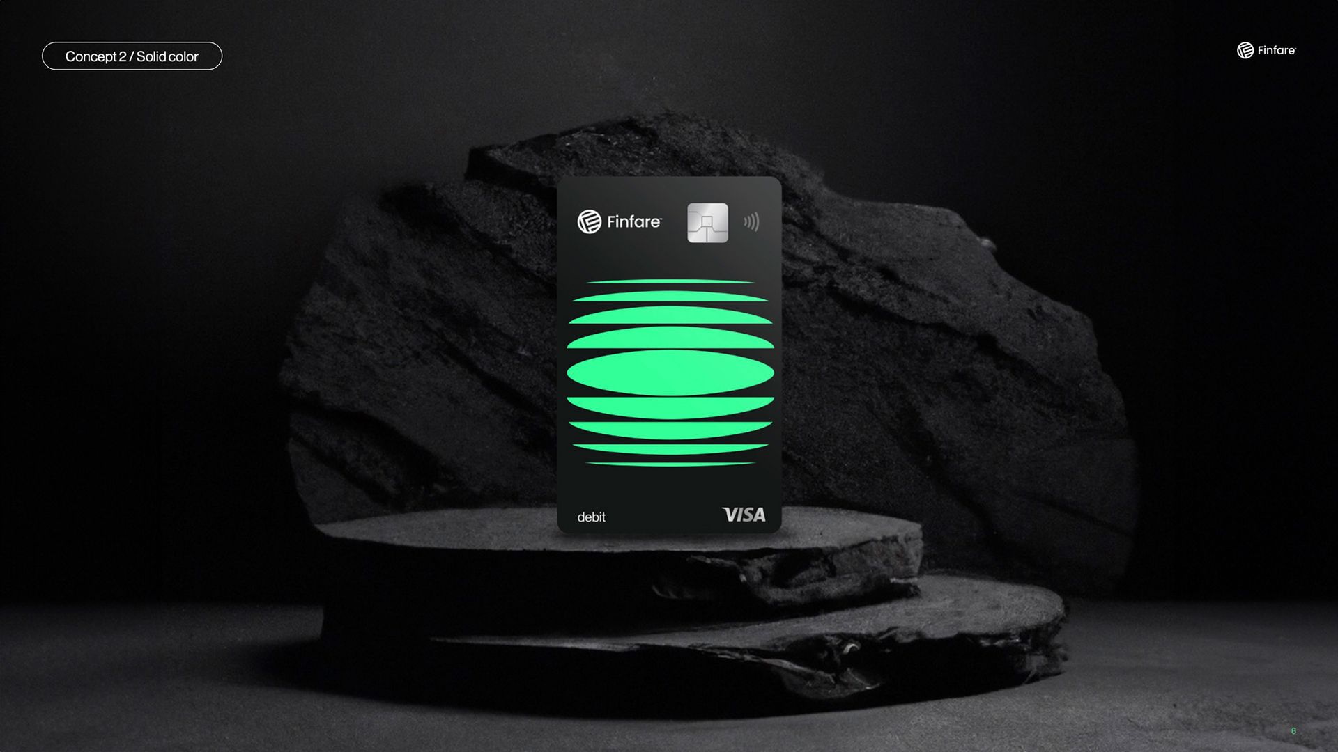
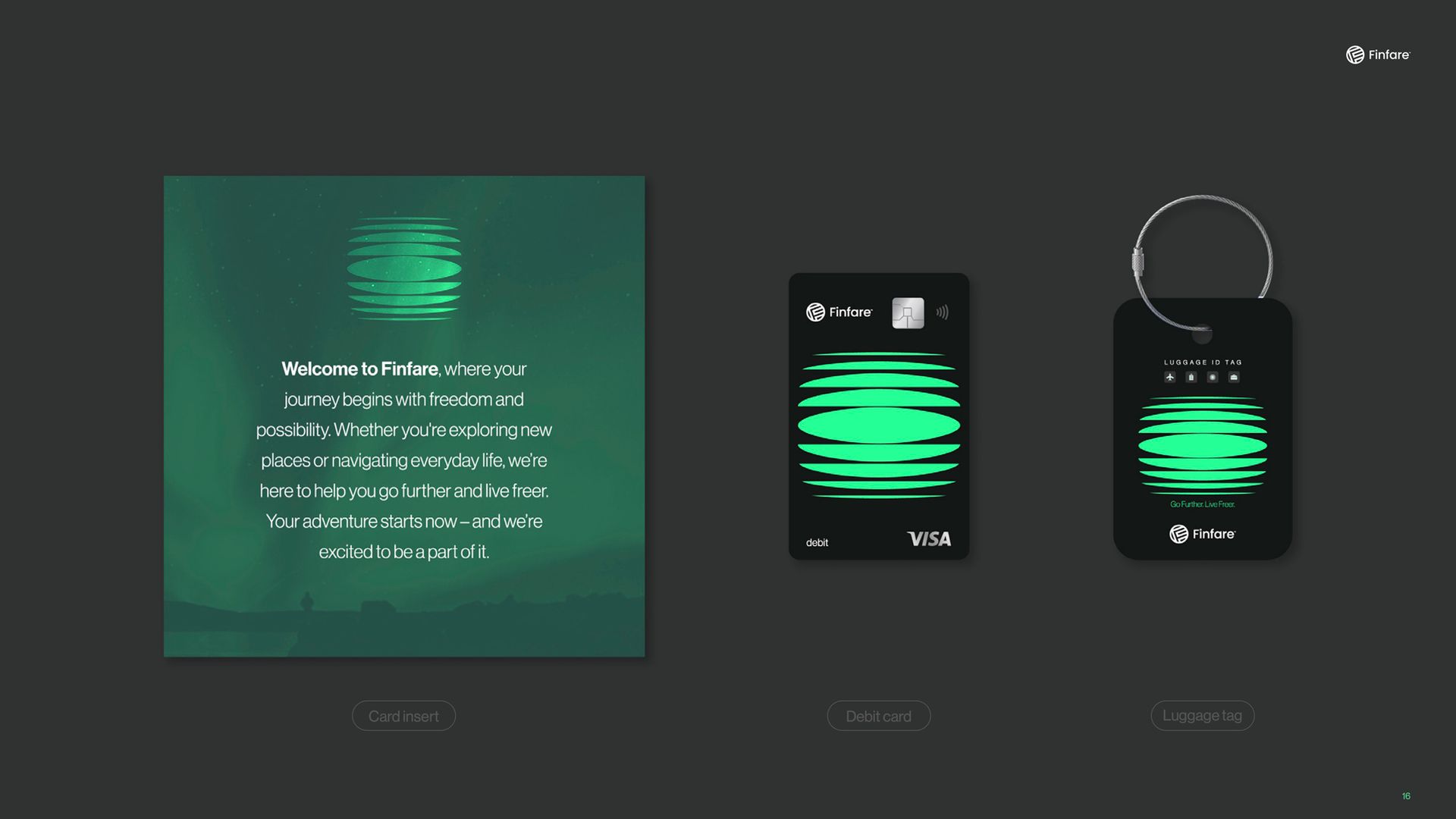
Scalable asset usage
A wide set of branded mockups shows how the identity adapts to digital, print, and wearable touchpoints—ensuring a cohesive visual experience, whether in pixels or real-world applications.
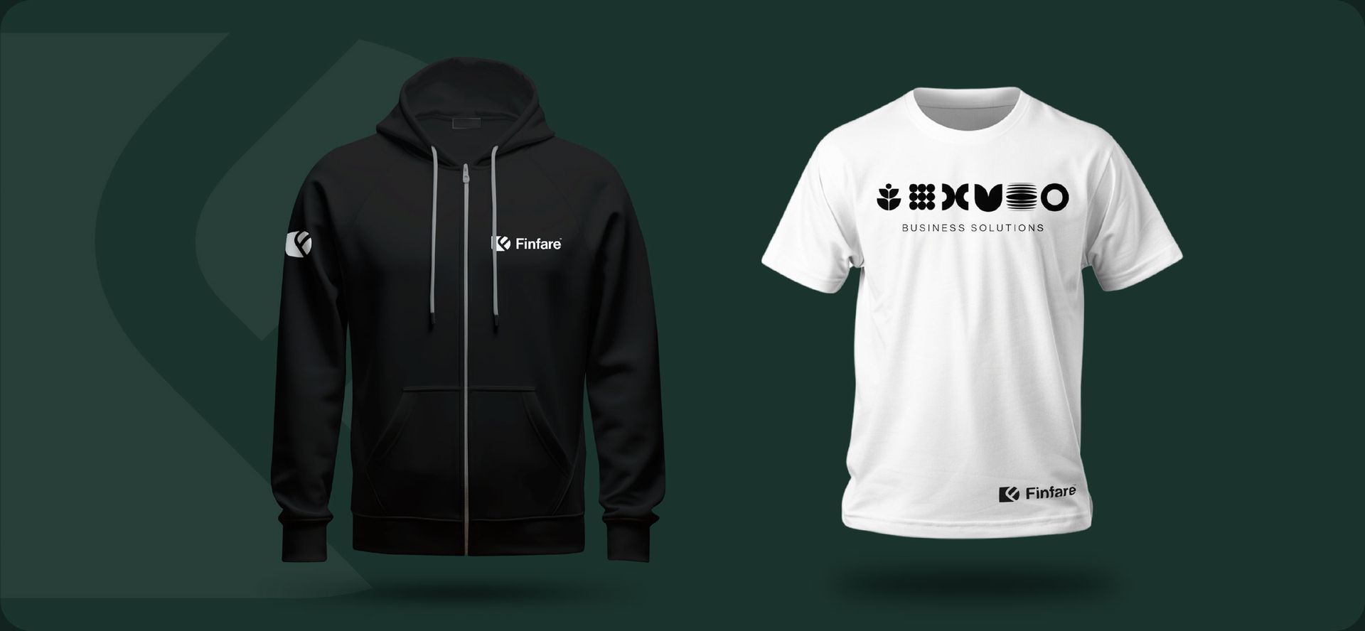
STATIONARY & MERCHANDISING
the results
Clarity
A cohesive visual system helped unify Finfare’s product, marketing, and internal teams.
FlexibilitY
The scalable design toolkit enabled faster content creation across departments and agencies.
Trust
The rebrand increased credibility with partners, investors, and enterprise clients.